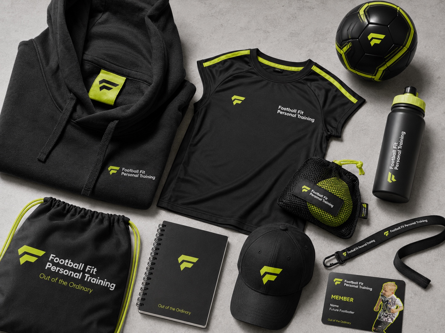
Branding
Football Fit PT 2026
Giving a new football brand a strong start.
Big ambitions start with the basics.
Football Fit PT is a new training company focused on helping young footballers improve through dedication, high-quality 1-to-1 coaching.
With the business just getting started, the brand needed a visual identity that could instantly communicate what Football Fit PT is all about – performance, progression and a genuine passion for the game.
Our job was to give them a confident visual foundation from day one.
Something professional enough to build trust. Energetic enough to feel at home in football. And distinctive enough to stand out both on and off the pitch.
Client
Football Fit PT
Industry
Fitness
Looking established from the very first whistle.
Starting a new business comes with one slightly awkward challenge: you need people you trust you before you’ve had years to build that reputation.
For Football Fit PT, the visual identity needed to help bridge that gap. Parents needed to see a professional coaching service that could feel confident investing in, while young payers needed to see something exciting, aspirational and relevant to the sport they love.
Too corporate, and the brand would lose its energy. Too playful, and it could struggle to communicate the level of professionalism behind the training.
The sweet spot was somewhere in the middle. Serious about development. Still obsessed with football.
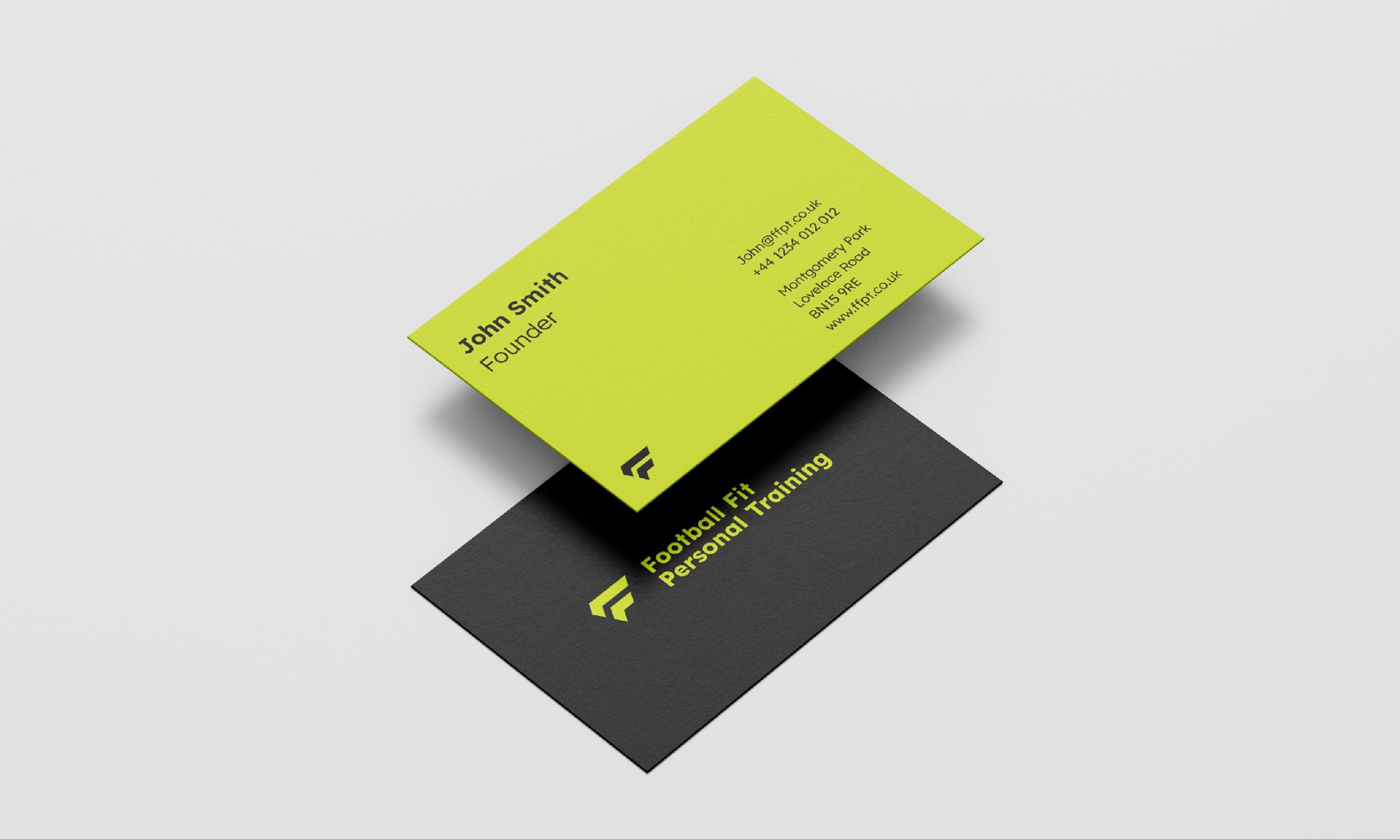
A visual identity built for development.
We created a bold, confident identity designed to give Football Fit PT a strong presence from launch.
The visual direction was build around movement and performance, giving the brand an energetic feel without relying on the usual football cliches.
We developed a consistent look and feel that could work across the business as it grows – from coaching materials and social content to printed collateral and future digital touchpoint.
The aim was simple: Make Football Fit PT look like it belongs in the game from day one.
A new brand ready for kick-off.
Football Fit PT now has a clear, professional identity that gives the business a much stronger foundation for growth.
The refreshed visual direction helps communicate the quality and ambition behind the coaching, while giving the brand enough personality to connect with young footballers and their families.
From the first impressions to printed flyers, everything now feels part of the same team.
Bold. Focused. Full of potential… a pretty good way to start, if you ask us.
What else?
Branding
Visual brand upgrade ahead of app launch
Website
New and improved website redevelopment
Branding
Visual Identity
Visually enhancing a new start up
We use cookies to personalize content, provide social media features, and analyze our traffic. We also share information about your use of our site with our analytics partners. You can change your preferences at any time. For more information, please see our Privacy Policy and Cookie Policy. Privacy Statement